DAVIDDOES is a visual identity and video series where I explore new interesting topics, travel to cool cities and do things I’ve never done before.
Cold as 'Ice' | Nordic Daylighting - Iceland
Norwegian Newb | Nordic Daylighting - Norway
Doing it Danish | Nordic Daylighting - Denmark
An animated infographic of my travels around the united states
coalition of remote doctors
i created this visual identity for doctor entrepreneurs and their new business venture of establishing a platform for sharing doctor resources in telemedicine. the brand was inspired by the acrynym “CORD” as a means of bringing people and ideas together, showcasing connection and overlap as well as broadcasting a new means of doing telehealth services.
logo and identity design
style guide development
website creation
I was interviewed by Corgan Medialab's Brandon Carmichael on Integrating Branding into Architecture and Interior Design
The architecture firm I work for, Corgan Architects, offers an annual prize to one employee to travel anywhere in the world. Individuals submit a proposal with a plan to study a design topic of their choice, and present the findings to the whole firm. I was the 2022 Corgan Explore winner and I showcased my Scandinavan travel and study to an audience of 400+ individuals at ‘Forum’.
this maps shows all of my travel across the continental united states via automobile and plane.
louisville, kentucky
new renovations to the historic churchill downs racetrack sparked a need for updated wayfinding site maps and building facility maps.
i led an effort to redesign the existing maps into 2d and 3d/axonometric views for both print and digital platforms. the maps have been used for three runnings of the kentucky derby now with slight modifications done each season as new additions to churchill downs are added.
boulder, colorado
the center for academic success and engagement, also known as the case building, on campus at university of colorado boulder, was a unique branding challenge with an incredibly successful outcome. the similarities of hiking boulder’s challenging trails with a student’s educational journey inspired a creative tool kit of environmental graphics and signage for this building. the case building is figuratively and literally the starting point for potential students visiting cu boulder. the offices within the case building use an abstracted topographical map pattern to identify entries, each department has a “trail marker” identifying its location, and the atrium lobby showcases a dimensional flatirons mountain art piece that is a metaphor for students starting their journey here.
photos by rudar manning
buffalo, new york
after completing a full locker room phase 1 renovation, the buffalo bills initated a phase 2 renovation to update the team meeting rooms, central lobby, war room and practice field. this phase 2 renovation included a full environmental graphics and signage package that builds on the foundation of the bills’s rich history and success in western new york.
hexagon geometry was a strong design element used in the phase 1 locker room renovation. the hexagon-chevron pattern i created blends well with the existing logo system and color palette. this pattern also found uses beyond the building’s environmental graphics, as seen in the photo of the custom designed field pads.
photos by kim smith
field photo by kevin hoffman / usa today sports
minneapolis, minnesota
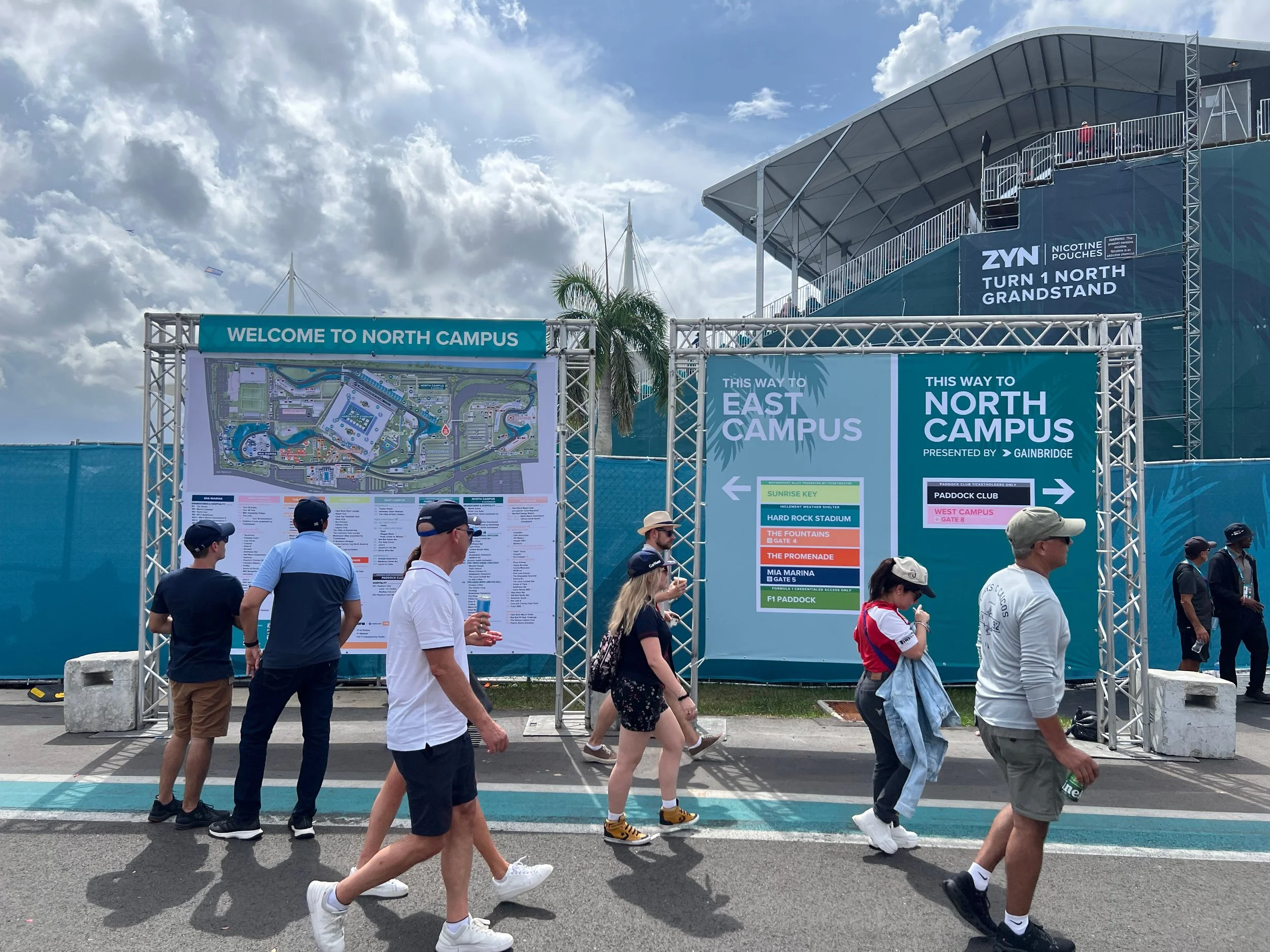
coherent circulation is one of the most important aspects in the successful operation of any major event. This applies to all user groups and Populous works through all the routes being used inside and outside a venue to develop clear strategies to suit the requirements of each specific event.
i assisted in all phases of the signage plan including planning & design, fabrication coordination and installation. This signage system for us bank stadium for super bowl 52 allows for spectators to easily find entries, gates and their way around an event site as well as establish the back of house operational functions providing both wayfinding and informational aspects to event staff and support.
the nostalgia of the 1940s soda fountain drugstore, the american drive-in, and refreshing soft-drinks was the inspiration for a contemporary food truck business venture in austin, texas.
the "soda pop" branding system is bold, immediately recognizable, and provides a clear image of the company. the brand is well defined by the quintessential soda fountain pinstripes, straw, and color scheme. the peppermint red and white became the iconic brand colors that translate well across media and scale. this brand was created utilizing alina wheeler's identity fundamentals from her 2004 book, designing brand identity.
an infographic is a visual tool stemming from the fields of information design and data visualization. this tool allows users to quickly understand complex data and information through visual methodologies. this project utilizes many information design principles from graphic designer edward tufte's book, envisioning information, like the use of small multiples, micro / macro readings, and a narrative of space and time.
this project focused on creating a piece of information design on the 2012 presidential campaign and displays the various ties and locations in which they were worn by president barack obama and governor mitt romney during the 2012 campaign.
the fort worth community arts center is envisioned as a multidisciplinary cultural arts hub, which fills the need for an 800 seat theater in the fort worth area. the project involved the restoration of the current 500 seat theater, addition of the new larger theater, a smaller black box theater, as well as additional gallery, rehearsal, classroom and dining spaces.
The building is designed as a large scale theater, with an audience as the public space, the stage as the "motherboard" or public circulation, and the back stage as the main program.
the central "motherboard" becomes the hub in which all other programmatic elements connect. internally, the motherboard is mainly used for circulation, but it also houses gallery space, lecture nooks, and balconies overlooking downtown forth worth. the outside covering is made of a digital led light screen that changes color and function according to the use.
this semester-long project was co-created with shaheen gazvini and jennifer lauring.
the native american navajo pottery & culture exhibit showcases history, pottery, and lifestyle of the native american people of the southwestern united states. this exhibit was carefully designed for red square, located within the design school north building at arizona state university in tempe, arizona. the manual was created as a reference guide to construct the exhibit. each component is diagramed and dimensioned to achieve an ideal representation of navajo pottery & culture.
drawing from references of navajo history, culture and architecture, the space is designed to mimic a traditional hogan structure. the entire exhibit is plated with cedar plank panels for a visual aesthetic quality, but also to entice the olfactory sense. the exterior wall panels each contain unique artifacts and video touch-screens that relate to pottery history, artistry and functionality. the central space has video projections that display high impact imagery and video scenes of navajo pottery and culture.
rio de janeiro, brazil
rio de janeiro is an incredible city, known for its lively celebrations, scenic topography, and diverse people. I traveled with a group of masters degree students in architecture, landscape architecture, and urban design to observe public space in an effort to transfer some of the key findings found in rio to our studio project located in mesa, arizona.
with previous major events like the fifa world cup in 2014 and the olympics in 2016, rio de Janeiro quickly moved itself towards establishing itself as a world-class city. our trip had excursions to maracanã stadium, the main stadium for the world cup and olympic opening and closing ceremonies, oscar niemeyer's museum of contemporary art, and the iconic christ the redeemer statue, which overlooks the entire city. overall, the trip was a blast and I enjoyed every minute of it.